

E-commerce playbook

Best Practices for Product Images

Great product images are one of the highest-leverage things a store can get right. They drive clicks, build trust, and directly impact conversion rate. Keep this guide nearby when reviewing supplier shots or building a new product page.

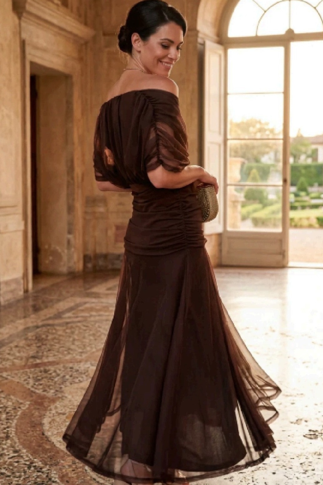
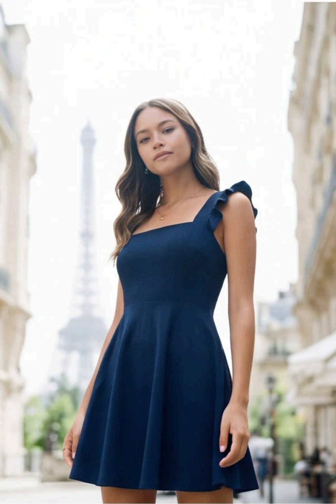
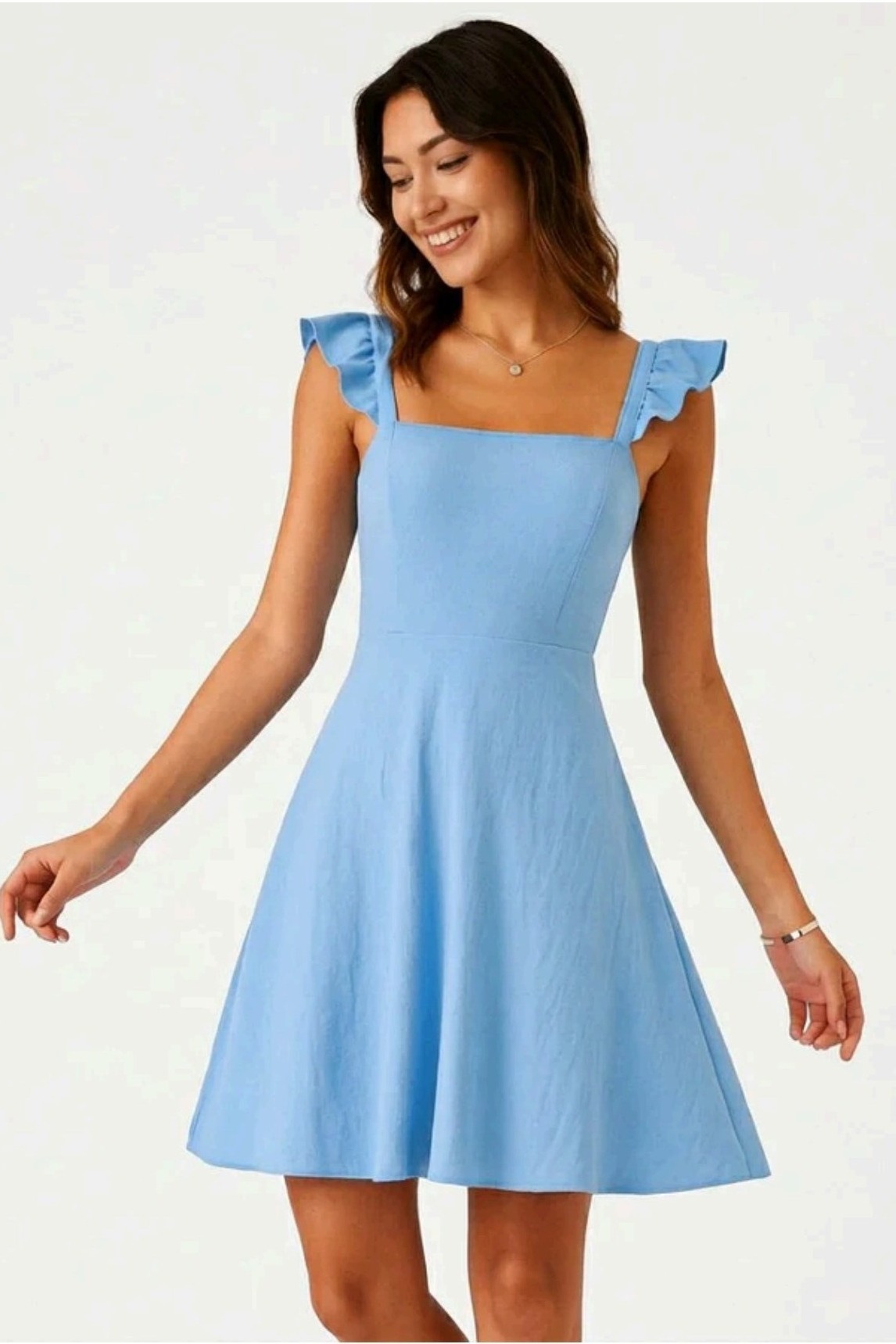
Product example
Product example
Product example
Product example
Product example

The eight rules

What consistently works.

Eight practices, refined across hundreds of e-commerce stores. Apply them and your product pages are already ahead of most of the market.

Mix up your image styles
01

Mix up your image styles

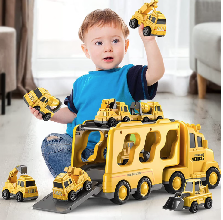
A great product page tells a story, and you can't tell that story with one type of shot alone. Aim for a healthy variety of single product images (clean shots that show exactly what the customer is buying) and lifestyle images (the product being used or worn in a real-world setting). Single images build trust and clarity; lifestyle images build desire. You want both.

Tip

Imagine a customer scrolling — single answers "what is it?", lifestyle answers "why do I want it?".

Quality is non-negotiable
02

Quality is non-negotiable

Every image should be sharp, well-lit, and high resolution. Blurry, pixelated, or poorly cropped shots instantly make a store look unprofessional and tank conversion rates. If it looks rough on a phone, it will look worse on desktop. When in doubt, leave it out.

Tip

Always preview at full size — if it looks soft or grainy, replace it.

Include 1:1 square images
03

Include 1:1 square images

Make sure at least some images per product are in a 1:1 square ratio. Squares display consistently across feeds, ads, and galleries — and they're essential in fashion, where shoppers expect that format from social media and marketplaces.

Tip

Square images double up as ad creatives — saving you time later.

Match models to your real audience
04

Match models to your real audience

In fashion — and especially women's fashion — more mature models tend to perform noticeably better. Most women shopping online are 35+, and people convert when they recognise themselves. Choose models that reflect the customer, not just trend imagery.

Tip

Ask: "Would our typical customer see herself in this photo?"

Use branding strategically
05

Use branding strategically

If a brand has presence and traction, subtle branding — recognisable colours, logo placement, a consistent visual style — can be powerful. It works best in narrow niches like pets where customers actively look for trusted brands. For broader stores, lean clean first.

Tip

Branding should support the product and never distract from it.

If you use AI, make it look real
06

If you use AI, make it look real

AI-generated images are normal in e-commerce now — but the goal is realism. Good test: if it takes a few seconds to tell whether it's AI, you've nailed it. If it screams "AI" instantly (weird hands, plastic skin, melted backgrounds), it's hurting trust.

Tip

Zoom in on hands, eyes, text, and product details — that's where AI gives itself away.

No text, promos, or watermarks
07

No text, promos, or watermarks

Avoid images with text overlays, promotional callouts ("50% OFF"), or watermarks. They make a store look like a cheap reseller, date the imagery the moment a promo ends, and often get flagged by ad platforms. Let the product page handle messaging.

Tip

If a supplier image has text or watermarks, request a clean version or skip it.

Aim for around 5 images per product
08

Aim for around 5 images per product

Around 5 images is the sweet spot — enough to show multiple angles, include a lifestyle shot, and highlight key details without slowing the page. Fewer feels thin; many more and shoppers skim past the most important ones.

Tip

A solid 5-set: front, back/side, detail close-up, lifestyle in use, and a square hero.

By niche

High-quality product images, per niche.

Different categories sell with different visual languages. Here's what good looks like.

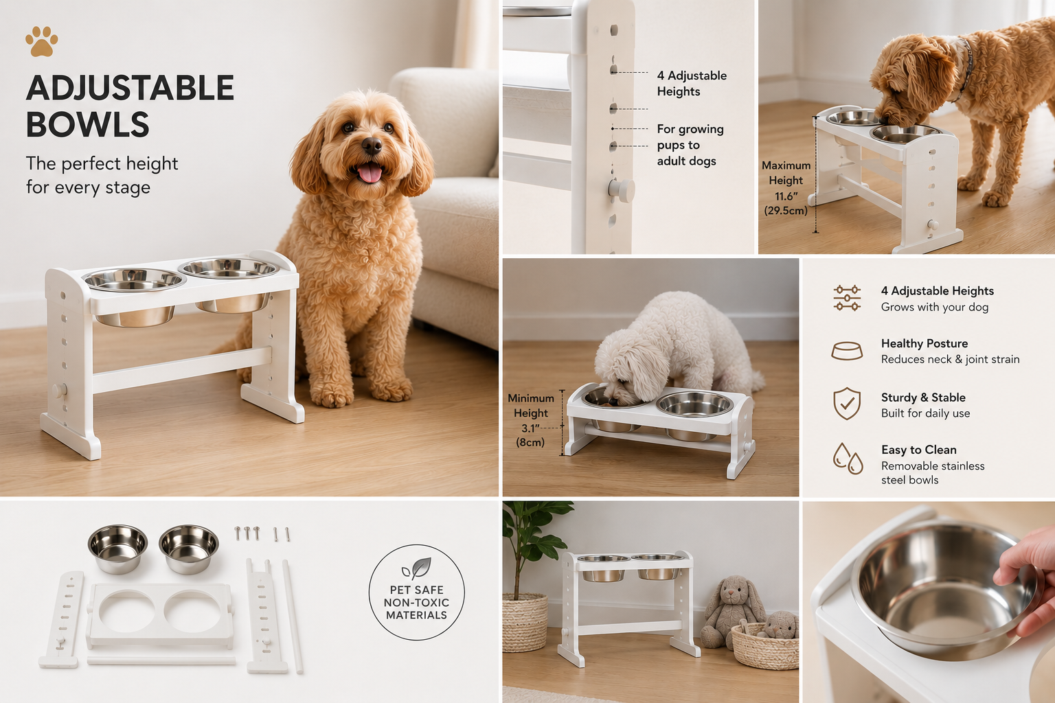
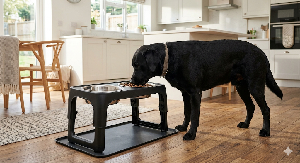
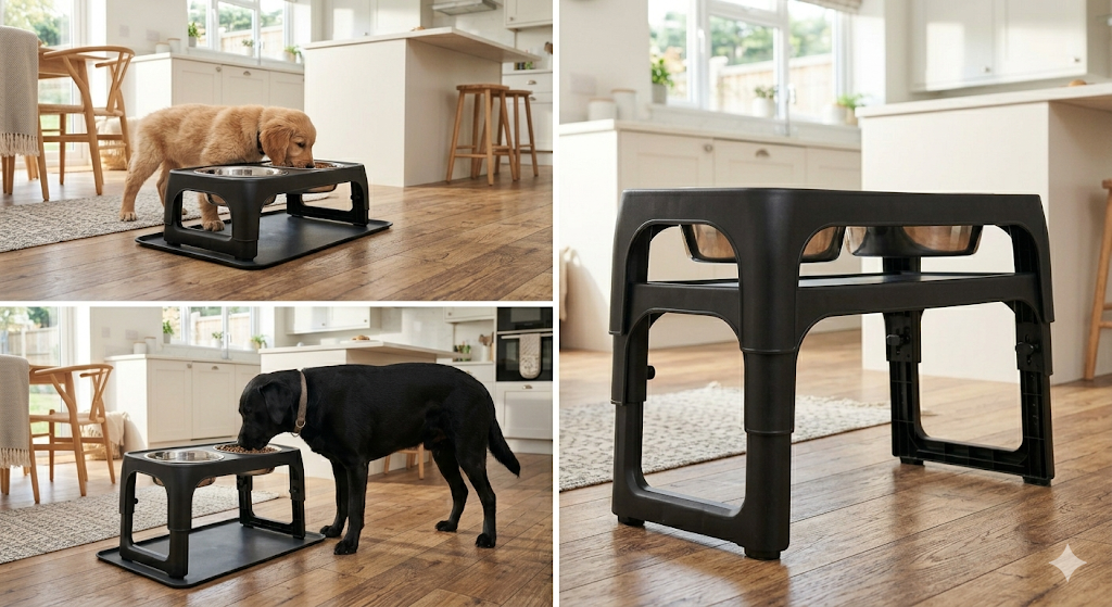
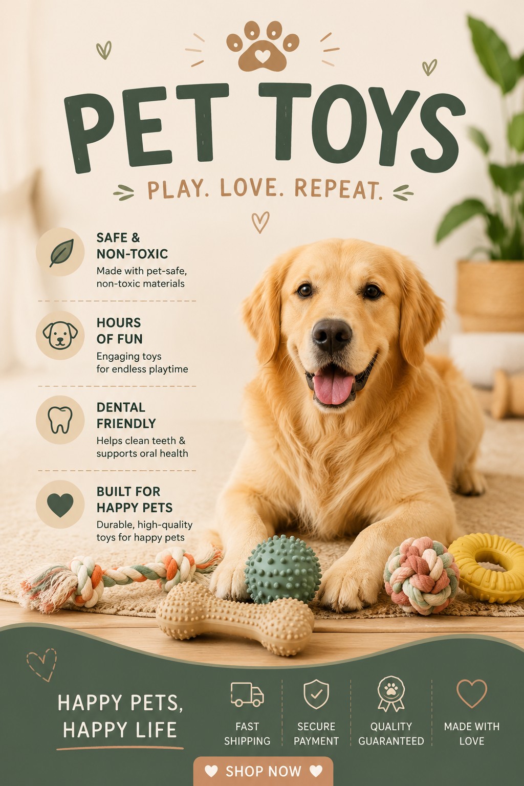
Pets product example 1Pets product example 2Pets product example 3Pets product example 4Pets product example 5

Lifestyle context, clean product detail, and infographic-style benefit shots.

1 / 5

Quick reference

Do this. Not that.

Do

  • Mix single-product and lifestyle shots
  • Shoot sharp, well-lit, high-resolution images
  • Include 1:1 squares — especially in fashion
  • Cast models that mirror your real audience
  • Aim for around 5 images per product

Don't

  • Upload blurry or pixelated supplier shots
  • Add text, "50% OFF" callouts, or watermarks
  • Use obviously fake AI with weird hands or skin
  • Over-brand before you've earned recognition
  • Cram 15+ images and bury the important ones

The short version

Variety, quality, the right ratio, the right people, smart branding, realistic AI, no text overlays, and around five images per product.

Get those right and your product pages will already be ahead of most of the market.